Nova: science for a curious mind
website & branding
OVERVIEW
A much-loved science information resource, Nova is the go-to reference website for a breadth of scientific disciplines.
Nova was a finalist in the best in digital design category at the 2015 AGDA awards.
CLIENT
Australian Academy of Science
AGENCY
Webplace
01
Final logo with departmental colourways
02
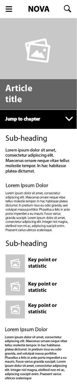
UX and wireframes (article page details)

Redeveloping the Nova brandmark required conveying the vast amount of subjects, and creating a logo that was instantly recognisable.
The concept has more than one representation: the outer ‘O’ is a reference to the circular nature of the universe – from the literal representation to the smallest molecule. The ‘eye’ strokes hint at discovery, connection and the limitless boundaries of scientific knowledge. The central ‘o’ symbolises radiance and growth.
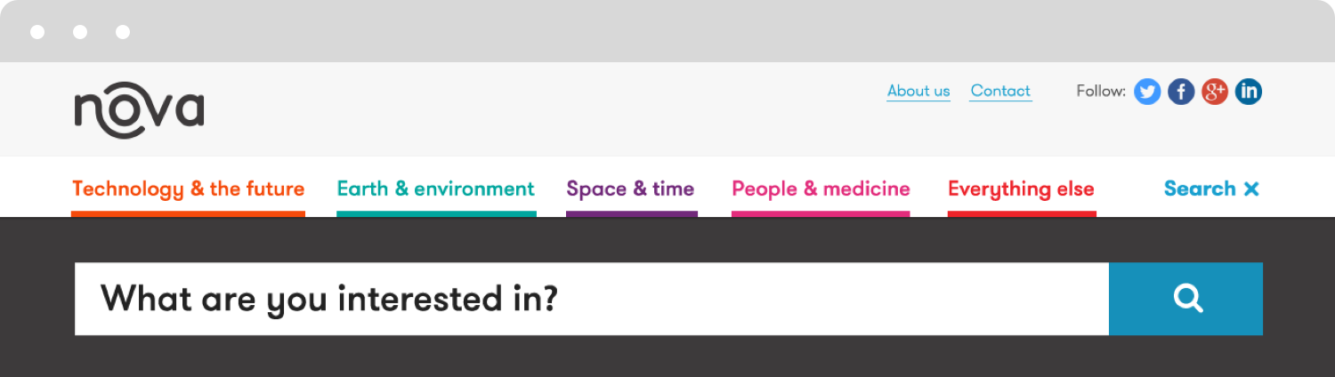
Oliver’s team designed the Nova logo to work in six colourways – one for each of the website’s topic categories. The colours cover the spectrum, act as a wayfinding aid and are accessible.
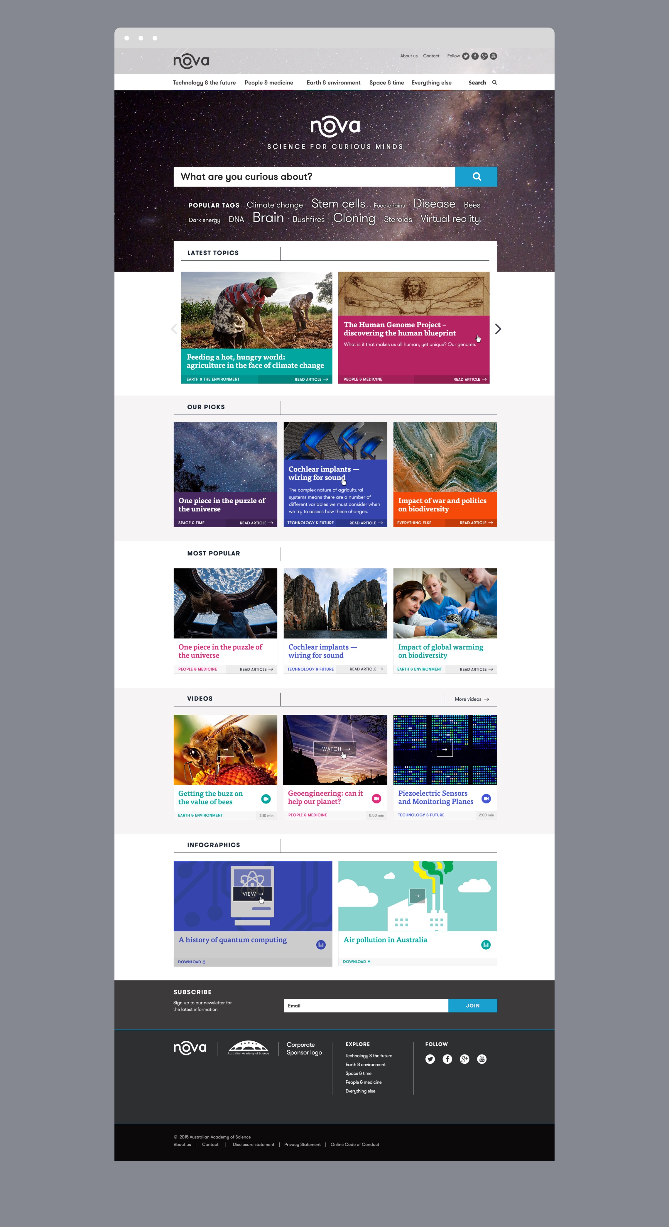
(Left) To create a distinctive and engaging experience, reducing the level of complexity was a goal of the wireframes. The rewarding solution allows the reader to explore a non-linear path tof content.
03
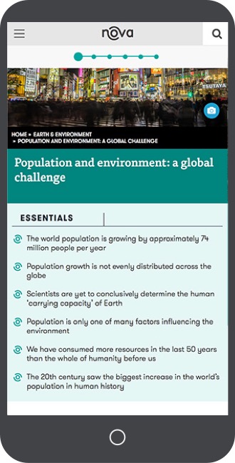
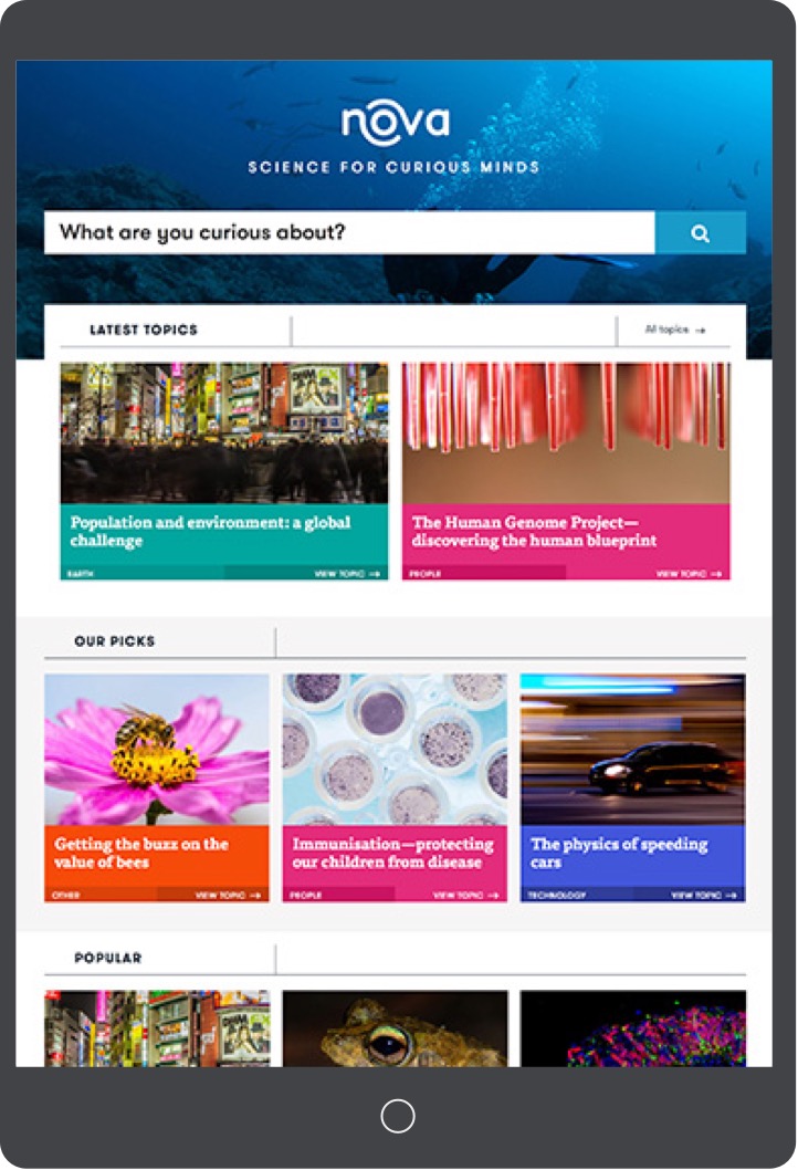
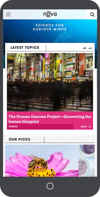
Responsive website article pages; home pages with dynamic header

04
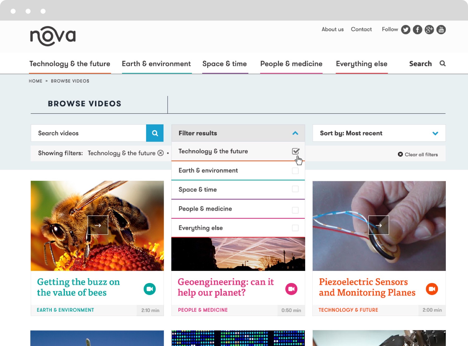
Website details: navigation and interactions
A graphic language was devised enabling the in-house team to produce ongoing communications and assets.

05
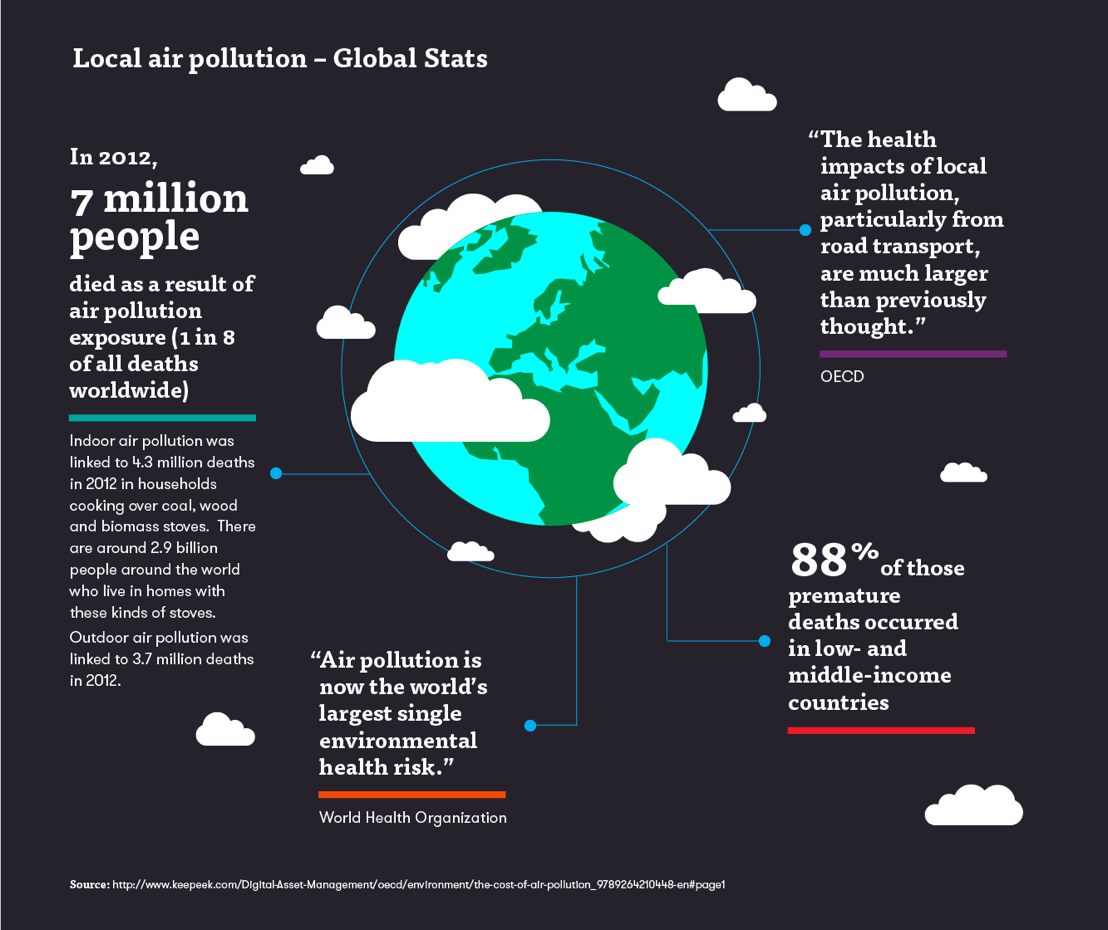
Infographics and visual language